Graphic Design Portfolio 2022
This is the digital edition of the my 2022 Portfolio, used during my graduating portfolio show. I’m very proud of each piece. I’ll add more as time goes on! Enjoy!
Personal Branding
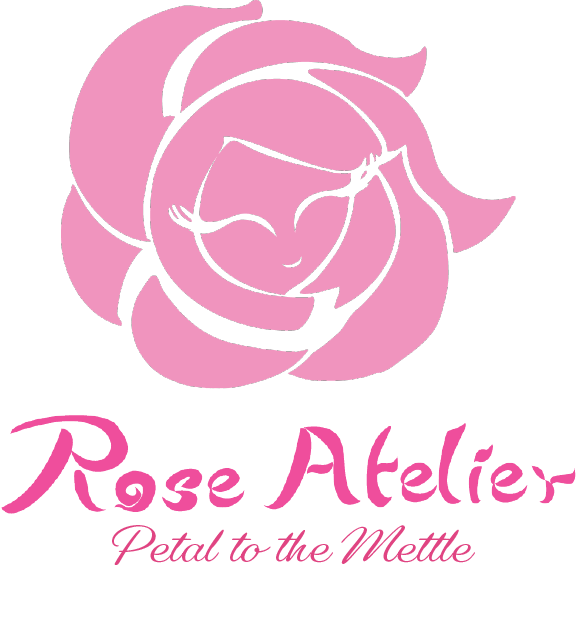
Rose Atelier is adorned by be recognized by my face character, Rosy. Her welcoming warm smile and curly petals give her a bright and open disposition, while the tiny edges and flicks still represent a rose’s thorns. Rosy demonstrates how we are a cheerful, energetic attitude with open arms. When making her originally, I took inspiration of a rose’s natural circular pattern and simplified the act of looking inside a rose and seeing a cute smile. In addition, by adding swift yet languid lashes and small curl of the lips to have a sweet look. The Tagline ‘Petal to the Mettle’ is a play on words of ‘Pedal to the Metal’. However, in the case of Rose Atelier instead of it meaning just to go faster, it means to apply delicate care like a petal to internal tenacity and strength.
Fae Ring Tavern
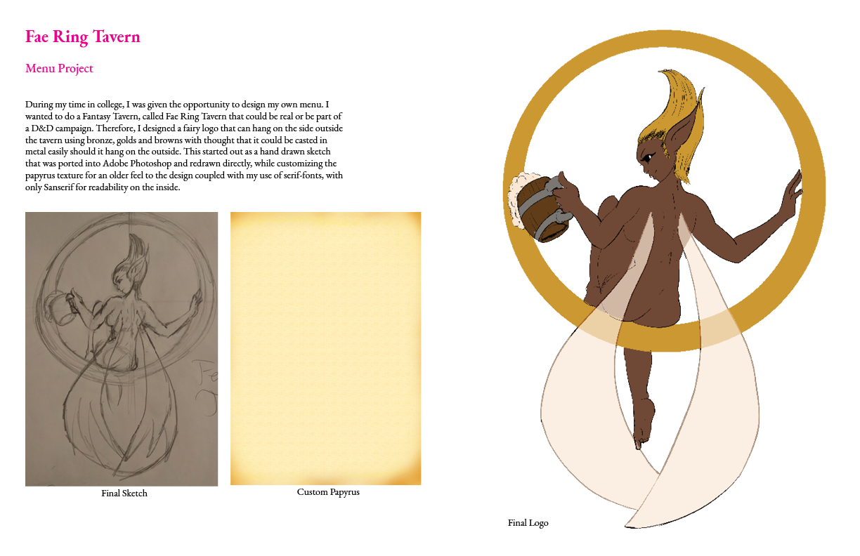
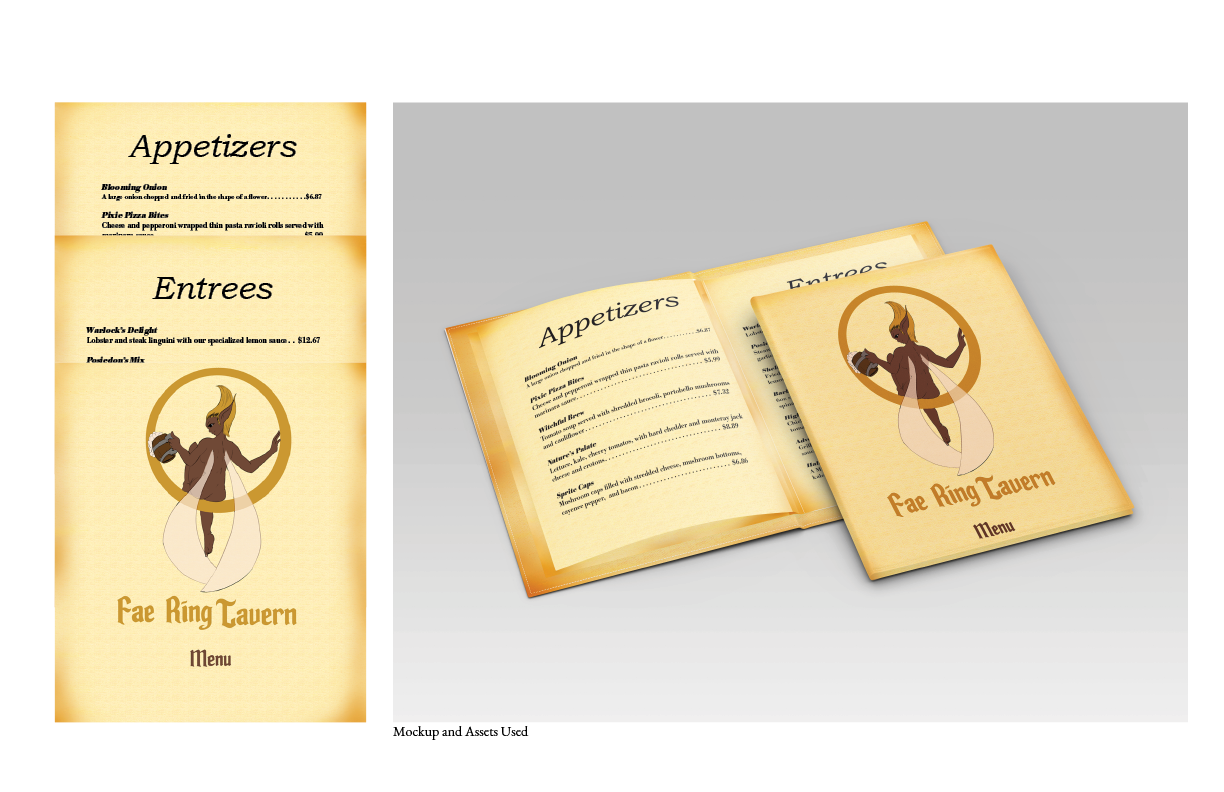
During my time in college, I was given the opportunity to design my own menu. I wanted to do a Fantasy Tavern, called Fae Ring Tavern that could be real or be part of a D&D campaign. Therefore, I designed a fairy logo that can hang on the side outside the tavern using bronze, golds and browns with thought that it could be casted in metal easily should it hang on the outside. This started out as a hand drawn sketch that was ported into Adobe Photoshop and redrawn directly, while customizing the papyrus texture for an older feel to the design coupled with my use of serif-fonts, with only Sanserif for readability on the inside.
Anansi The Spider
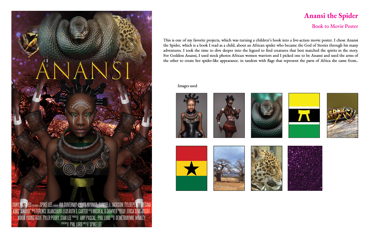
This is one of my favorite projects, which was turning a children’s book into a live-action movie poster. I chose Anansi the Spider, which is a book I read as a child, about an African spider who became the God of Stories through his many adventures. I took the time to dive deeper into the legend to find creatures that best matched the spirits in the story. For Goddess Anansi, I used stock photos African women warriors and I picked one to be Anansi and used the arms of the other to create her spider-like appearance. in tandem with flags that represent the parts of Africa she came from..
Drawn
This project was one of the first time I mixed my own art and photography. Drawn is my take on the CD/Vinyl project because I decided to make a CD based off the Looney Tunes. To make a Hip Hop/ R&B vibe I took the most famous and oldest characters and re-Tooned, their canonical outfits to something they might wear. I took inspiration from each character’s oldest or most used animation sheet and adapted my style to mimic it. They were first drawn on paper, line art was done in illustrator, and I colored and compiled them in Photoshop to get the result. The picture of my self was taken by a brick wall at the Charleston Music Hall which was used along with other custom-made assets.

For the Love Of Manga
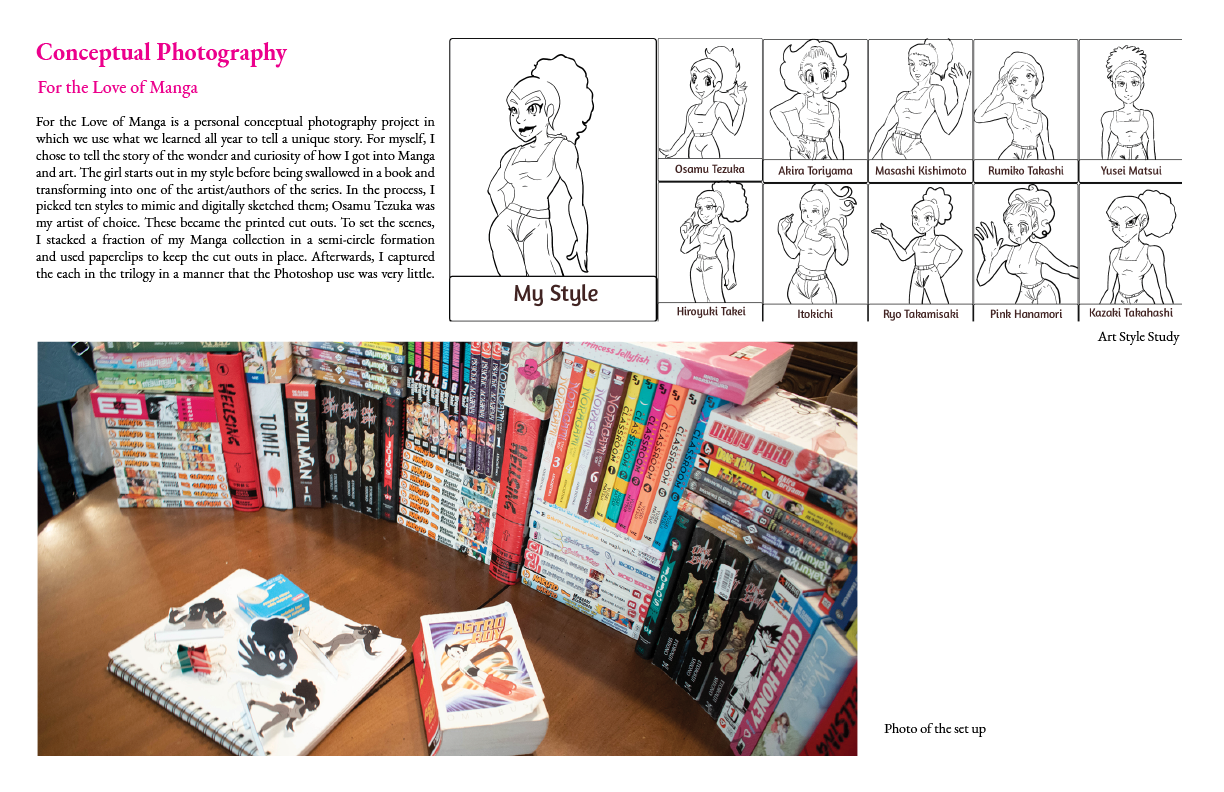
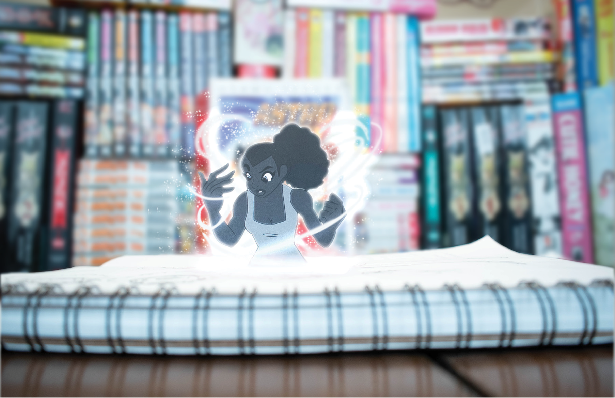
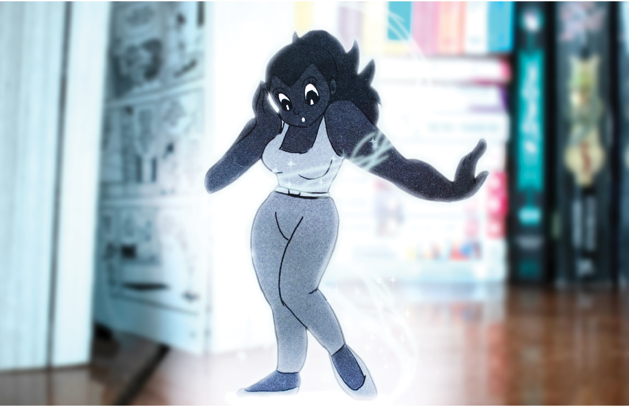
For the Love of Manga is a personal conceptual photography project in which we use what we learned all year to tell a unique story. For myself, I chose to tell the story of the wonder and curiosity of how I got into Manga and art. The girl starts out in my style before being swallowed in a book and transforming into one of the artist/authors of the series. In the process, I picked ten styles to mimic and digitally sketched them; Osamu Tezuka was my artist of choice. These became the printed cut outs. To set the scenes, I stacked a fraction of my Manga collection in a semi-circle formation and used paperclips to keep the cut outs in place. Afterwards, I captured the each in the trilogy in a manner that the Photoshop use was very little.
Sailor Moon & Art Nouveau
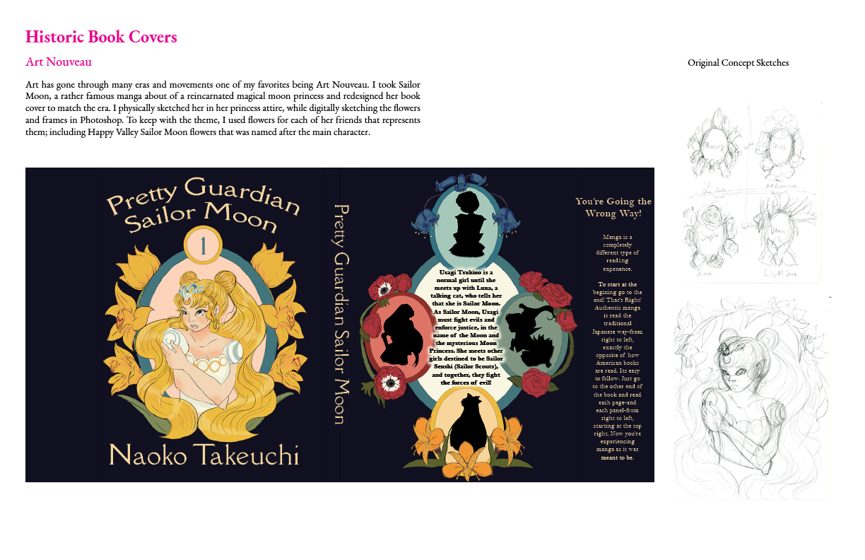
Art has gone through many eras and movements one of my favorites being Art Nouveau. I took Sailor Moon, a rather famous manga about of a reincarnated magical moon princess and redesigned her book cover to match the era. I physically sketched her in her princess attire, while digitally sketching the flowers and frames in Photoshop. To keep with the theme, I used flowers for each of her friends that represents them; including Happy Valley Sailor Moon flowers that was named after the main character.
Children’s Book Concept
What You Hear is the concept of a children’s book about Poppy Puppy, about not listening to rumors. I took inspiration of books from my childhood and designed each character by hand and digitally. I wanted the designs to feel soft and childlike therefore which is why I made a simplified color palette with somewhat unsteady lines.

Birthday Duotone
This was a personal summer project that coincided with my brother’s 24th Birthday. He was and is always there for me and I wanted to make a portrait for him to celebrate him and his budding career as a musician. I used one his photos that he had professionally done, and his three favorite colors to make two color portraits of him paying attention to color from darkest to lightest. I meticulously followed the natural shapes and contours of his face in Illustrator and matched the Lumosity with red and gold.

Traditional Design – Attack of the Metal Army
Attack of the Metal Army was a traditional painting project, where we were all given a title of a book that does not exist and paint what we think the plot of the story is. For my version, I designed young mechanic and an android, that was running from a in a giant weaponized robot from that army. I hand drew the original character sketches, I made sketched several scenes before resting on the final. This was redrawn on canvas and painted in acrylic.

Social Awareness Project – Colorism
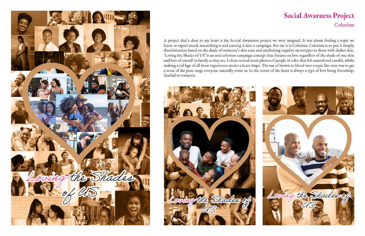
A project that’s close to my heart is the So-cial Awareness project we were assigned. It was about finding a topic we knew or experi-enced, researching it and turning it into a campaign. For me it is Colorism. Colorism is to put it simply, discrimination based on the shade of someone’s skin tone and attributing negative stereotypes to those with darker skin. ‘Loving the Shades of US’ is an anti-colorism campaign concept that focuses on love regardless of the shade of one skin and love of oneself or family as they are. I chose several stock photos of people of color that felt natural and candid, whilst making a col-lage of all those experiences under a heart shape. The use of brown to blend into a sepia like tone was to get a sense of the pure range everyone naturally come in. In the center of the heart is always a type of love being friendship, familial or romantic.
Junmai Monthly Magazine
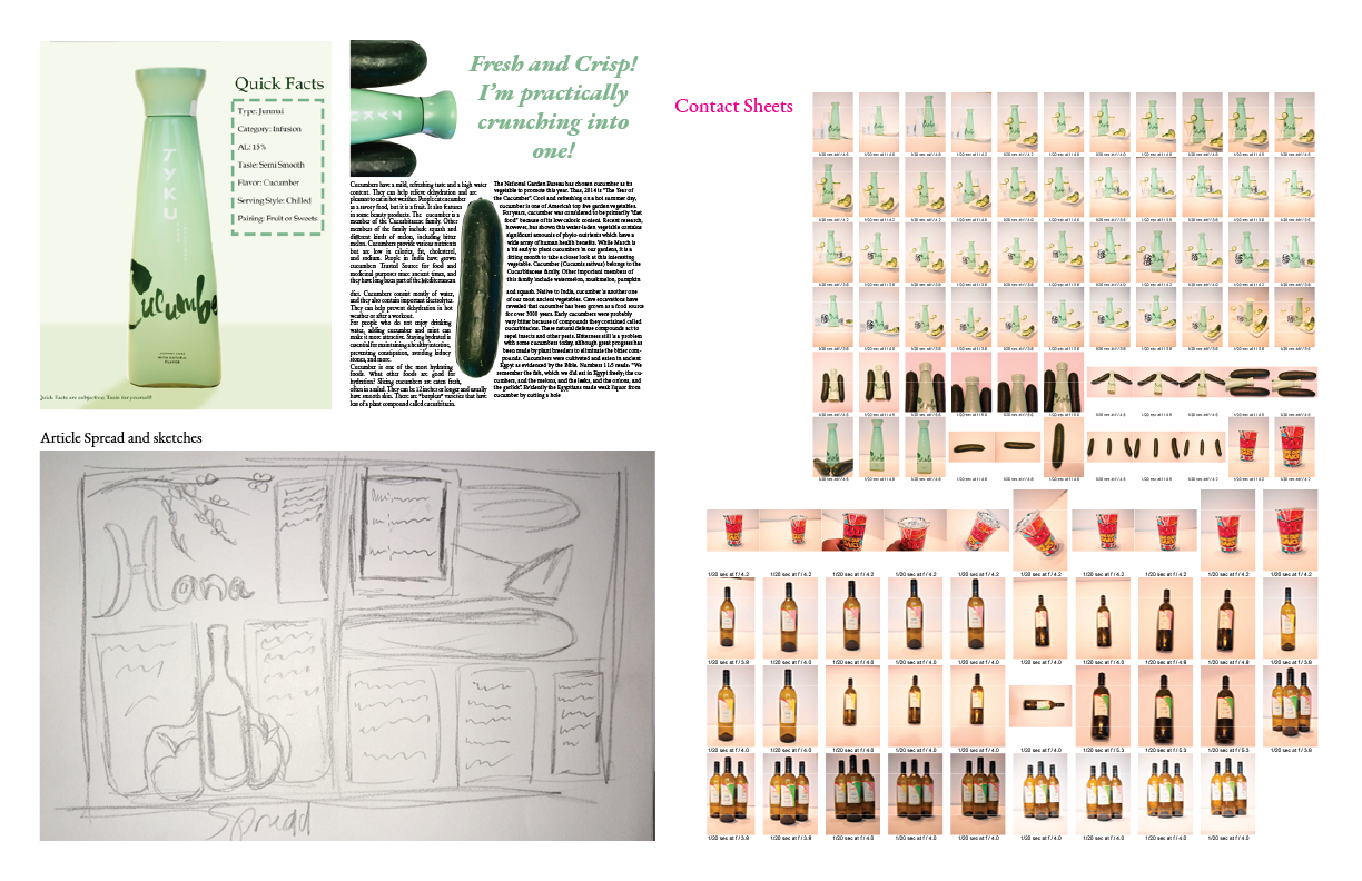
Junmai Monthly is a concept for a magazine project we were assigned. Junmai is the term used for a type of Sake that is purely rice wine/made in a 100% pure manner. For the beverages used in this project, have been taste-tested, recorded and photographed personally by me. The cover was made by using old Cheri glasses, parts of a personal Sake set, and cut cucumbers, an old curtain, and two posterboards. I took vertical high key photos that were polished in lightroom with the rest stitched in photoshop and solidified in InDesign. I matched the color palette and font of the products to maintained consistency. In addition, because the main attraction was simple, I kept that feeling throughout the magazine.
Character Design/Re-Design
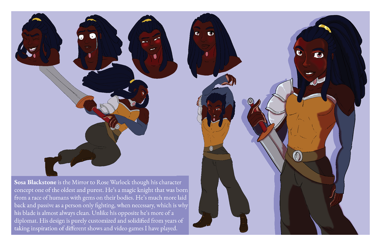
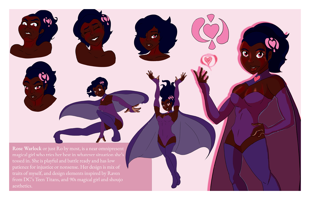
Over the course of my final year, I was given an opportunity to have a unique personal project. I chose to do Character Design because one of the first things that got me into art was drawing some of my favorite characters. Therefore, I took two original characters I carried from childhood to college and redrew their designs by finding root character inspirations or breaking them down piece by piece and solidifying them cohesively. Both have warm color palette and use a shade of rose pink as a source of power. Sosa overall tone is cooler given his natural laid-back personality to contrast Rose’s energetic bright personality.
*The shading is for print use, I have personal flat versions for comic and illustration purposes.
